Costume Design
As this was a modern dress movie, with a minimal budget, actual costume manufacture was only feasible for a few key costumes. Those two costumes were the bunny and Ray’s special concert t-shirt.
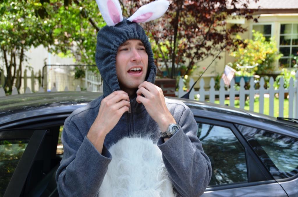
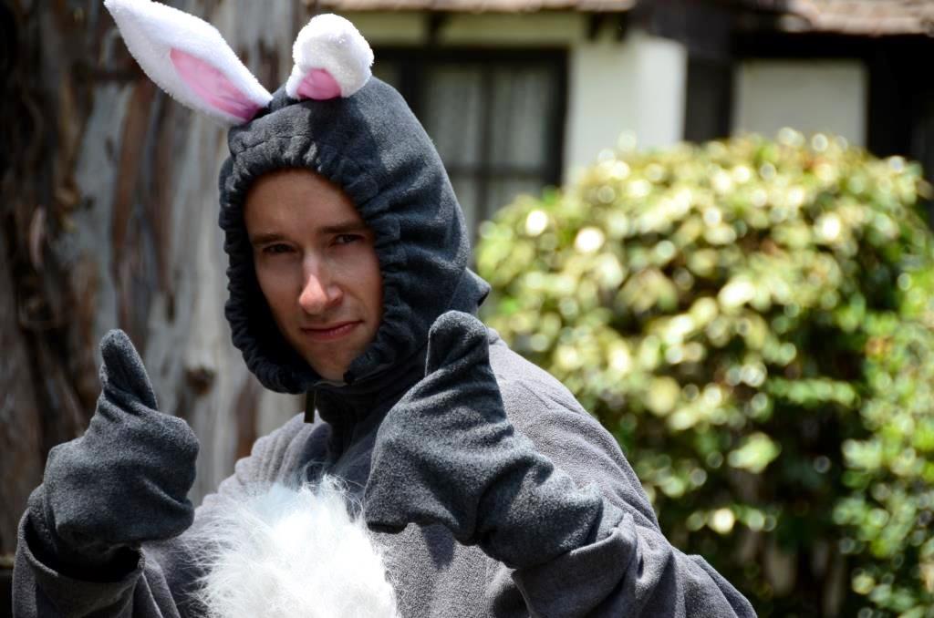
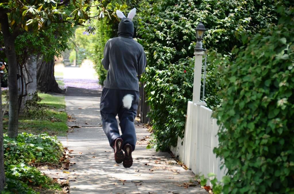
The bunny was a relatively simple bit of ingenuity by costume designer Paula Fradio who went to a thrift shop, bought $14 worth of fabric, a hood, old sweat pants and sweat shirt and did a little sewing. (I had bunny ears that were given out at a Graham Rabbit concert to complete the costume.)
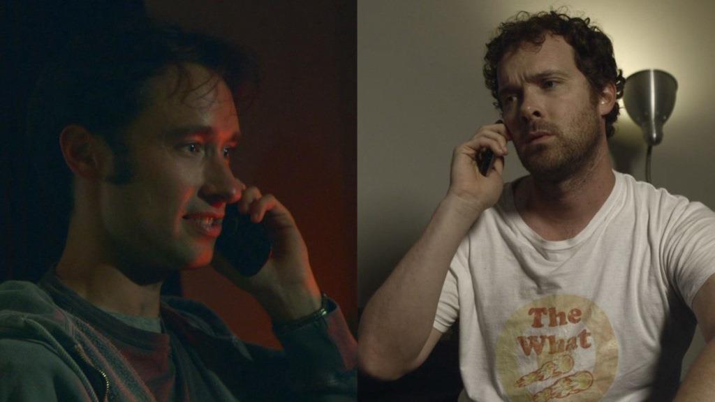
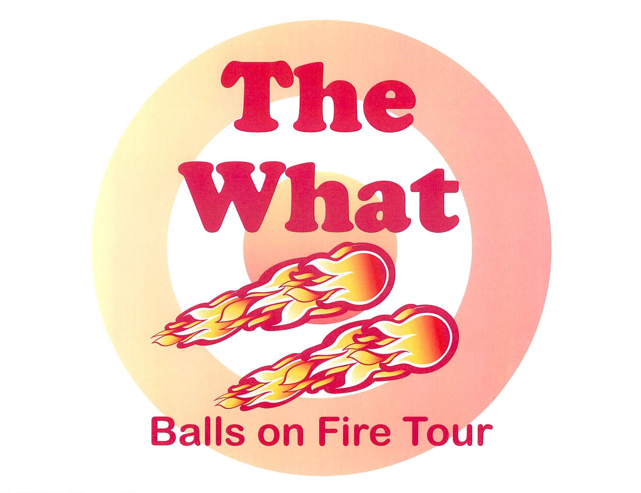
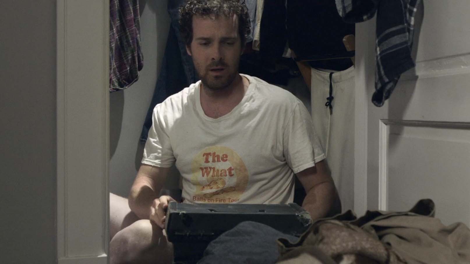
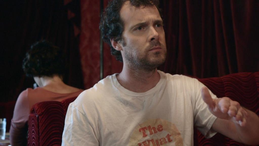
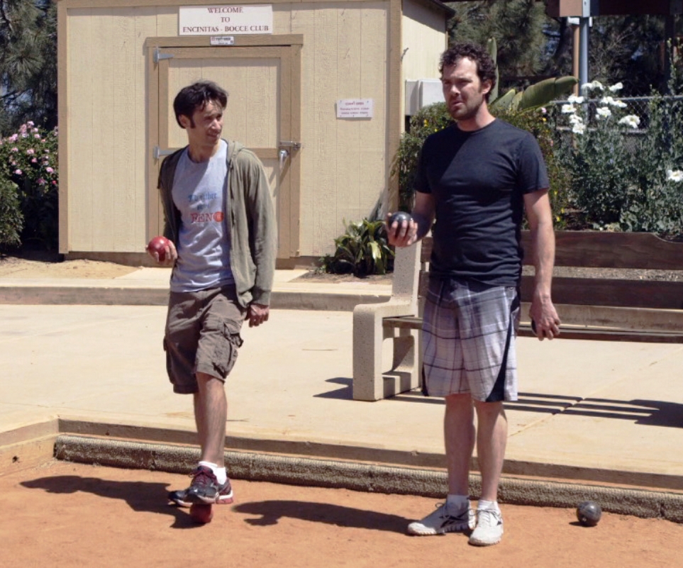
For Ray’s t-shirt, it was important that it fit within his sepia color scheme, i.e. it look old and well-worn. This would reflect the character’s depression in that he looks like he’s been staying home as much as possible AND conversely would wear something comfortable and familiar to try to make himself feel better. I made a rough drawing of two comets streaking across a target of the mythical band The What with the logo Great Balls of Fire tour. On the back were parody venues (but these never made it on camera). The design was multi-vocal: a parody of The Who’s t-shirt logo, a sex joke, a reference to the comet leitmotif and of course, the fake band’s name implies various “what” questions. What did you say? What do you want? What are we doing here? (Yes, “Why” would have been a more resonant, simple and clear, but “The Why” just doesn’t sound as funny as “The What”.) However, the quality of my free-hand drawing was decidedly mediocre. So, Paula enlisted her graphic artist husband to clean up my drawing considerably. She then transferred improved design onto a silkscreen, and printed it onto a number of brand new white t-shirt in a yellow and red-orange inks, then distressed that t-shirt to make it look quite old and well-worn.
As for the remainder of the costumes, Paula and I made a wardrobe visit to each of the two lead actor’s homes and from their closets, selected, and I approved, a coherent look for each character. (We did the same thing for the women but via email and jpeg’s since they had fewer costumes.)
She then made a Look Book for both Dave and Ray to keep track of their costumes for each scene. (The actors were their own dressers on set and I kept the Look Book to remind them of what they should be wearing.) Of course, we didn’t want them to have clothes that blended into the color scheme of the locations thus yellow (Ray’s location color) and red (Dave’s location color), respectively, were only accent colors for Ray and Dave’s clothes.
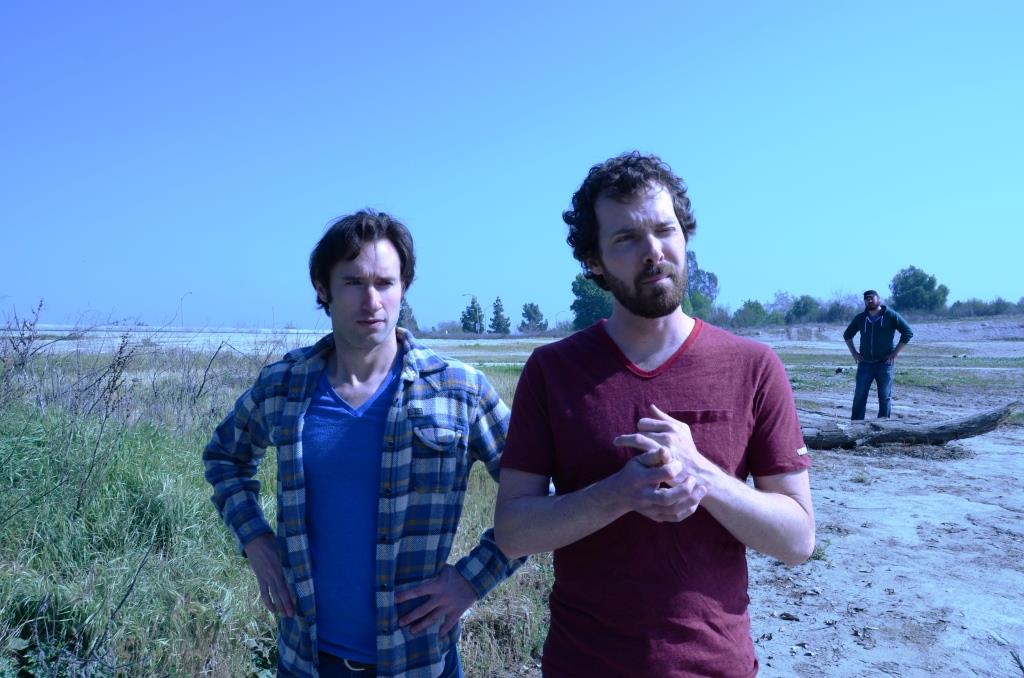
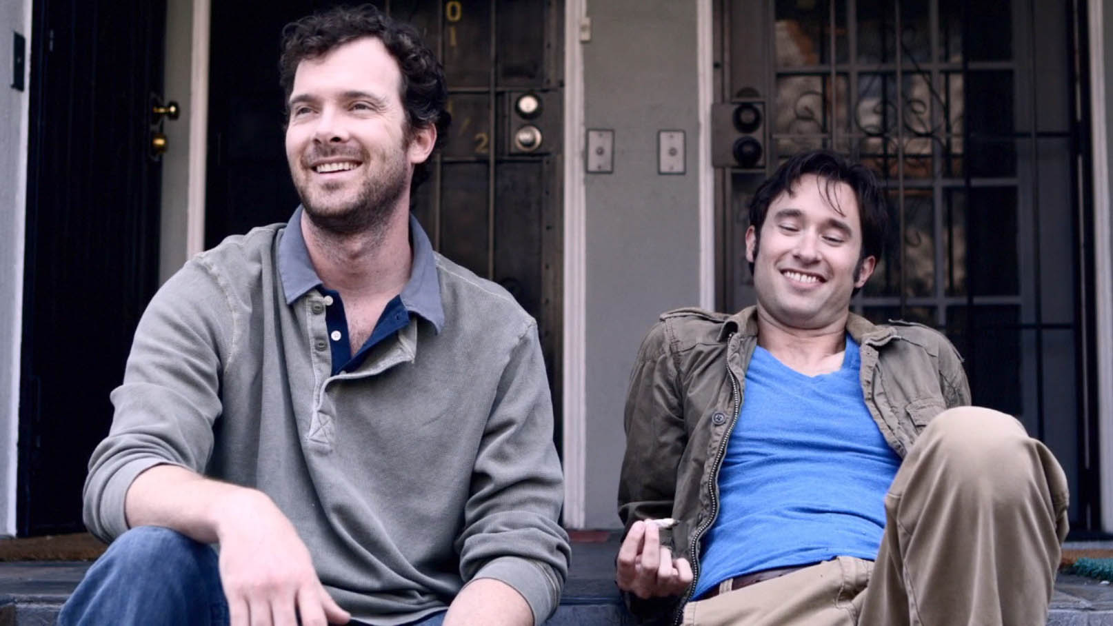
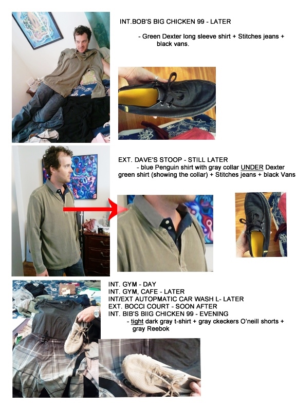
One of Paula’s ideas that I really loved was that Dave was always dressing in layers, thus externalizing his version of being “stuck”. Dave is still caught in unresolved feelings from childhood (very clearly delineated in a deleted road trip scene) and thus his feelings are hidden in deeper and deeper layers.
Costume Design

The What Logo Design (concept By Julius Galacki, Execution By Paula Fradio)

The What T-shirt In Action Home Alone

The What T-shirt In Action And Out In Public

Bunny Costume By Paula Fradio - Photo By Julius Galacki

Bunny Costume By Paula Fradio - Photo By Julius Galacki

Bunny Costume By Paula Fradio - Photo By Julius Galacki

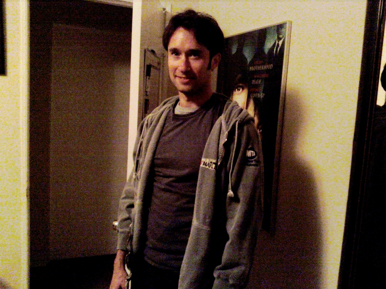
Even In The Warm Sun, Dave Is Wearing Layers

And Here Too (deleted Stoop Scene)

Dave Is Carrying One Of His Layers
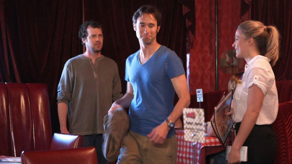

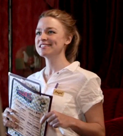
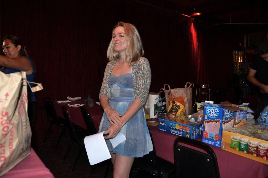
Paula Made Made A Name Tag Which Transformed Black Slacks And A White Shirt Into A Waitress Uniform

Behind The Scenes Photo - Beginning Of The Movie's Finale - Photo By Swati Srivastava

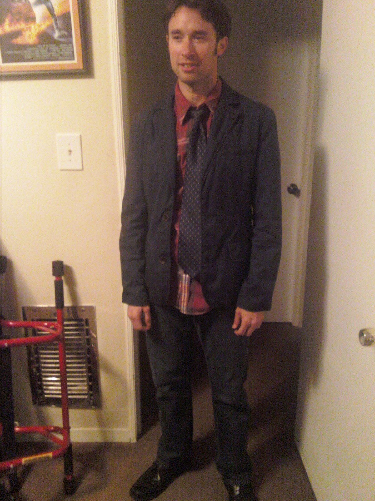
Ray Is More Formal For His Blind Date; Dave Is Used To Getting Women Is Dressed More Casually, And Layered - Screen Shot From A Deleted Scene

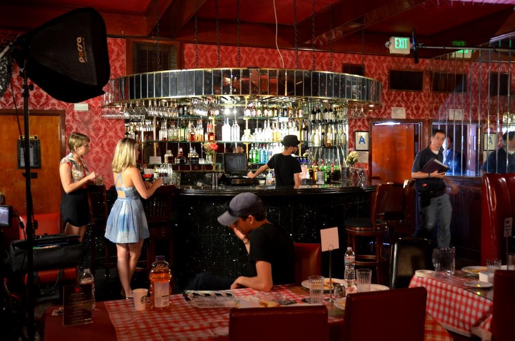
A Clear View Of The Waitress Dressed To Go Out Drinking - Behind The Scenes Photo By Swati Srivastava

Behind The Scenes Bar Scene - Photo By Swati Srivastava

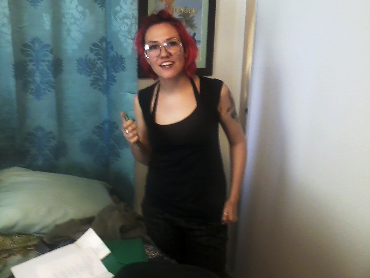
Amy Vorpahl's Costume As The Drunk Roommate With Ray - Photo By Swati Srivastava


Amy Vorpahl In Her Drunk Roommate's Outfit, Behind The Scenes Photo By Swati Srivastava

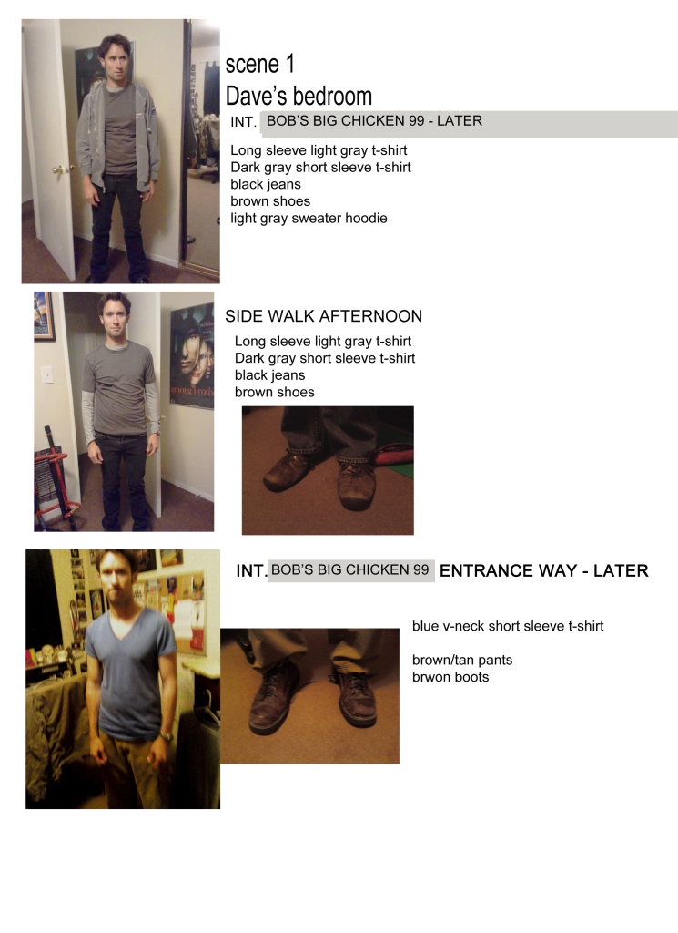
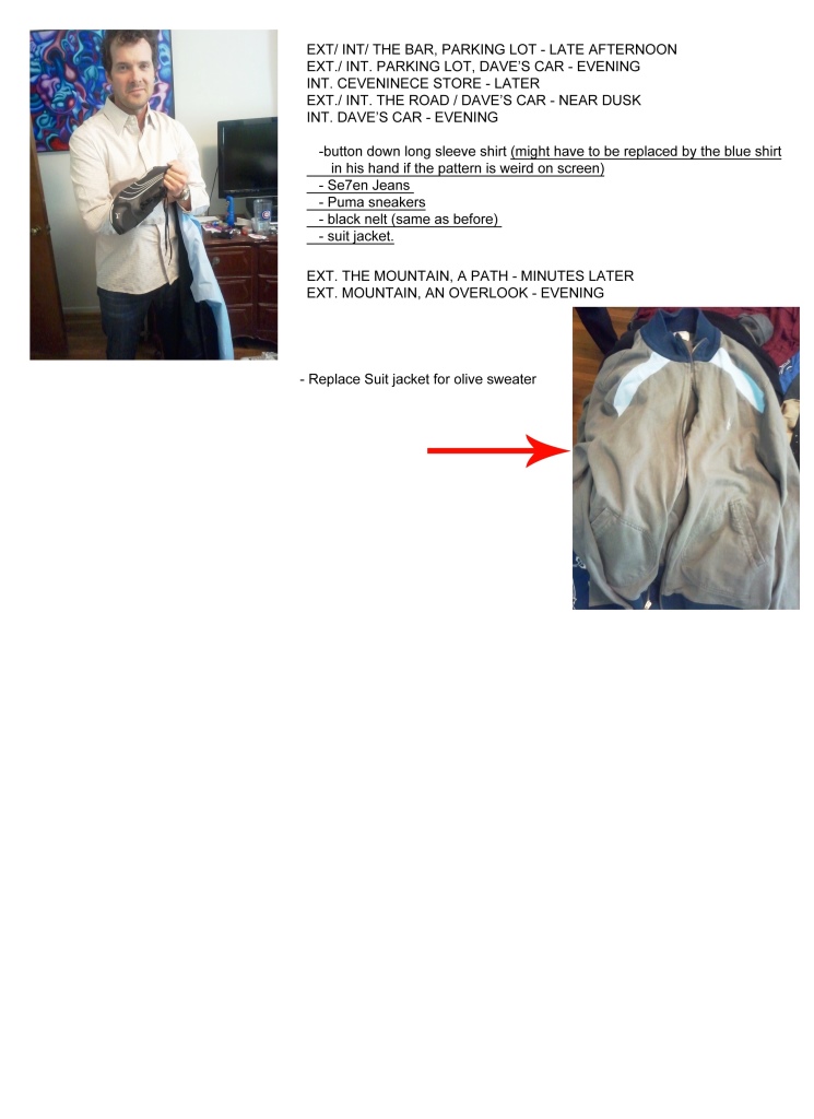
Dave's Look Book By Paula Fradio Using Photos Taken By JG On Our Site Visit
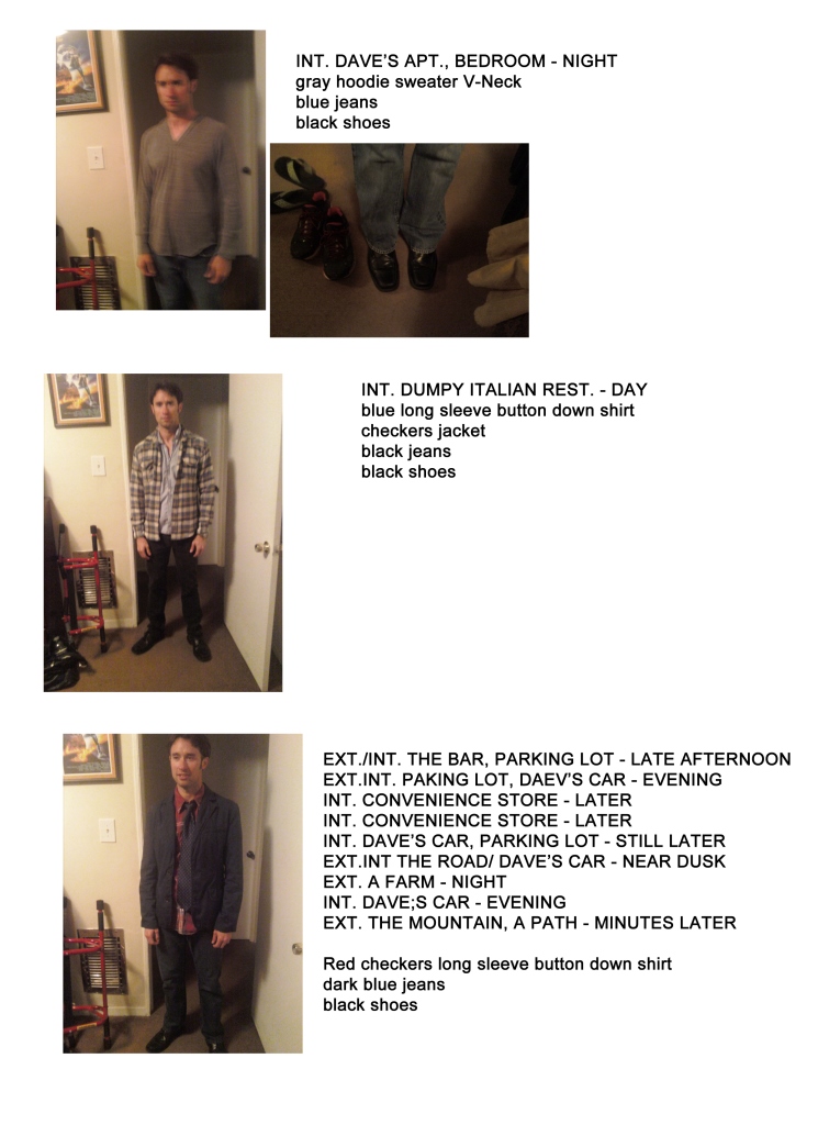

Dave's Look Book By Paula Fradio Using Photos Taken By JG On Our Site Visit
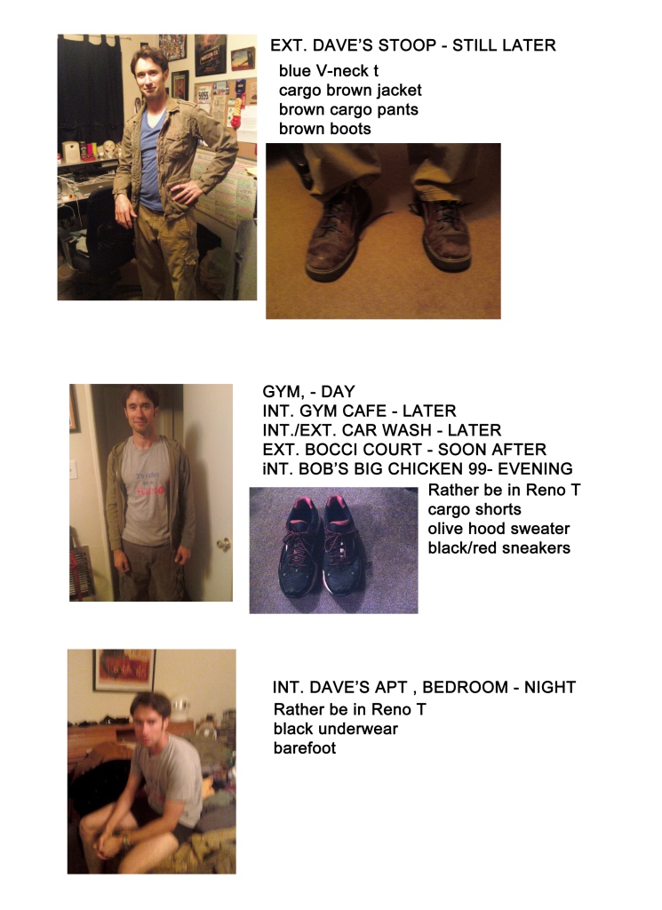

Dave's Look Book By Paula Fradio Using Photos Taken By JG On Our Site Visit

Dave's Look Book By Paula Fradio Using Photos Taken By JG On Our Site Visit

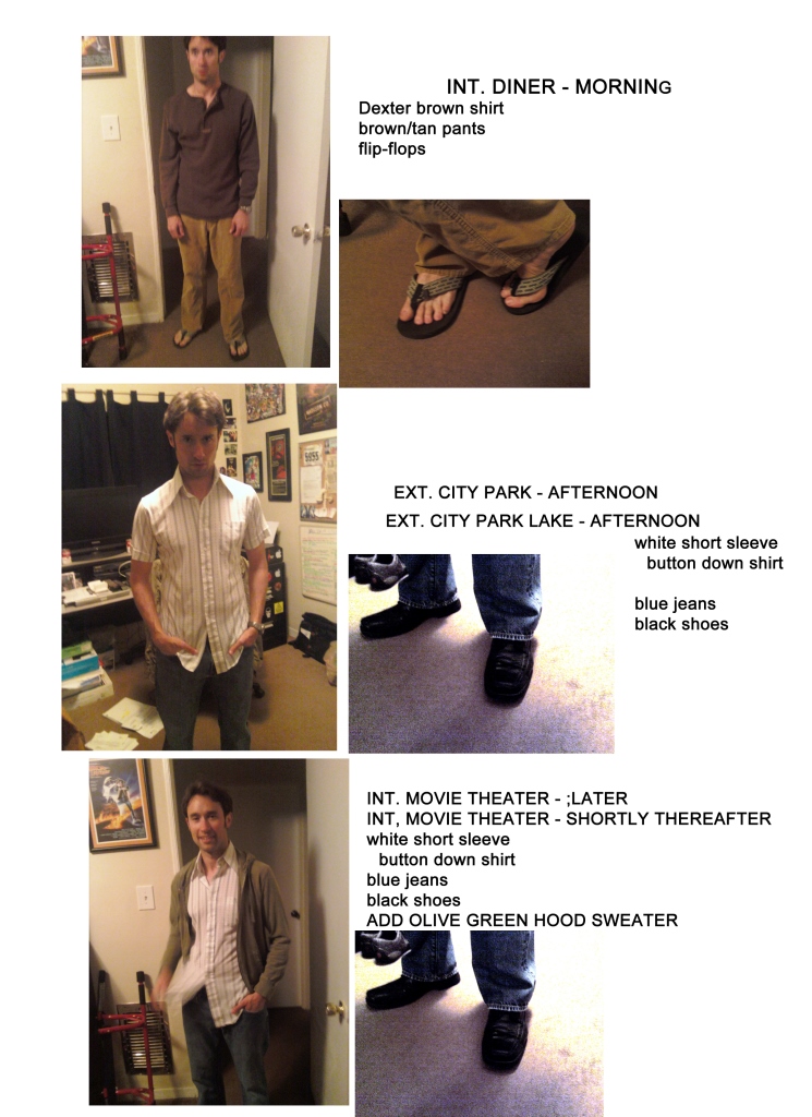
Ray's Look Book By Paula Fradio Using Photos Taken By JG On Our Site Visit
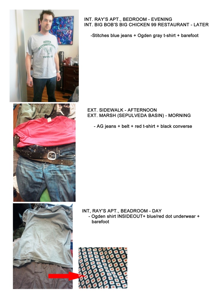

Ray's Look Book By Paula Fradio Using Photos Taken By JG On Our Site Visit
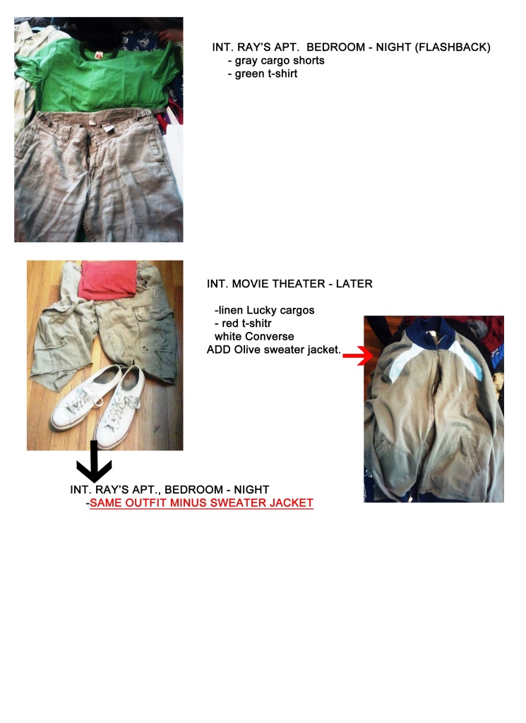

Ray's Look Book By Paula Fradio Using Photos Taken By JG On Our Site Visit

Ray's Look Book By Paula Fradio Using Photos Taken By JG On Our Site Visit
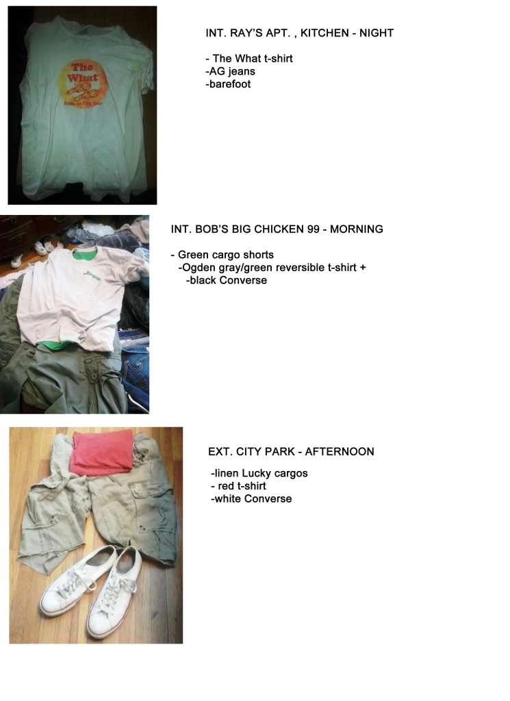

Ray's Look Book By Paula Fradio Using Photos Taken By JG On Our Site Visit

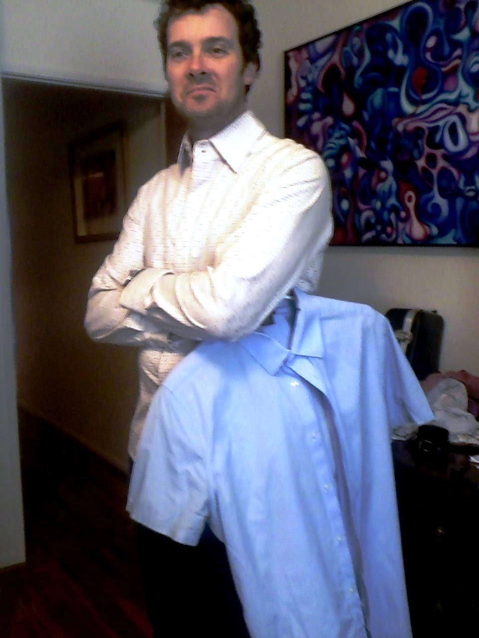
Drew Nye Trying On Various Outfits - Photo By Julius Galacki
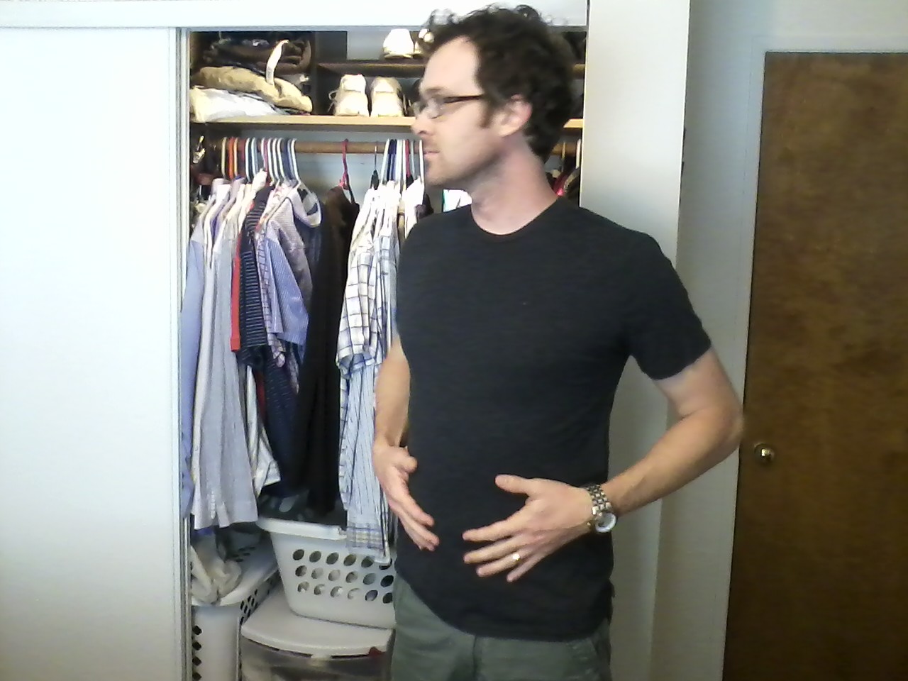

Drew Nye Trying On Various Outfits - Photo By Julius Galacki

Matt Mercer Trying On Various Outfits (notice The Layers) - Photo By Julius Galacki
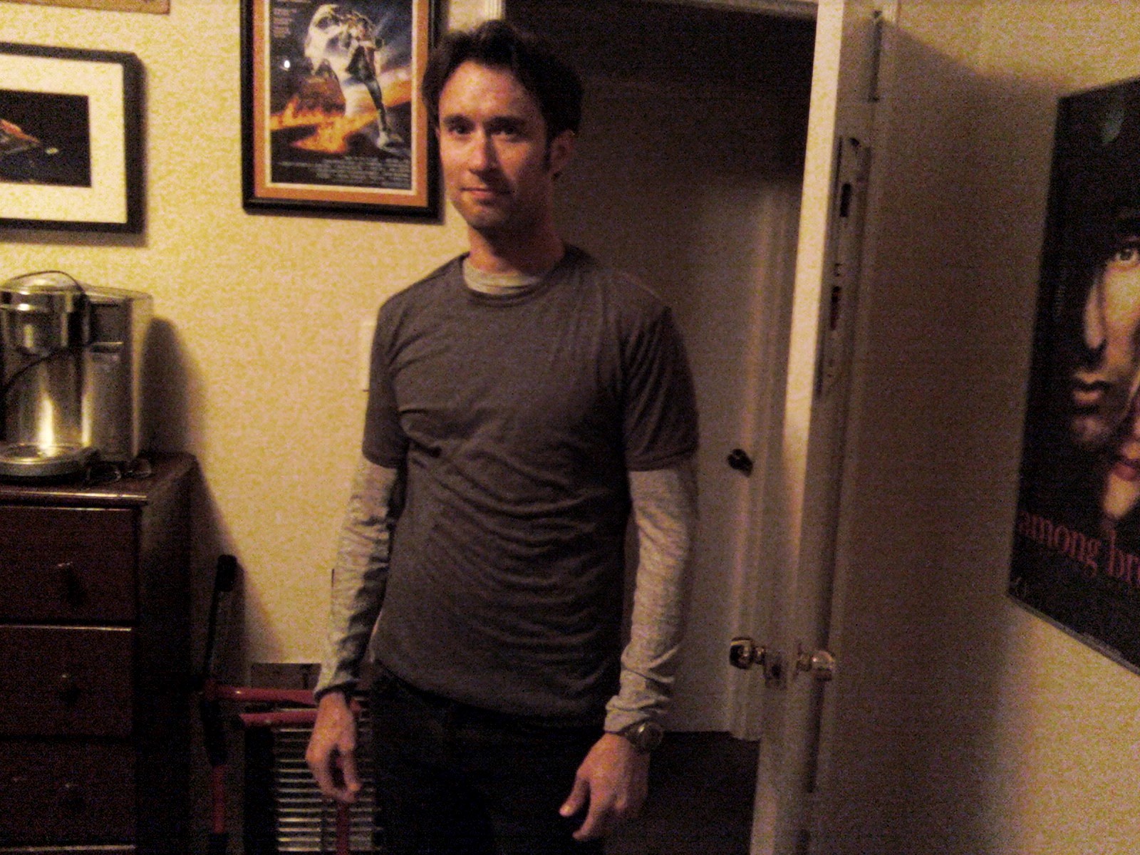

Matt Mercer Trying On Various Outfits (notice The Layers) - Photo By Julius Galacki

Matt Mercer Trying On Various Outfits (notice The Layers) - Photo By Julius Galacki

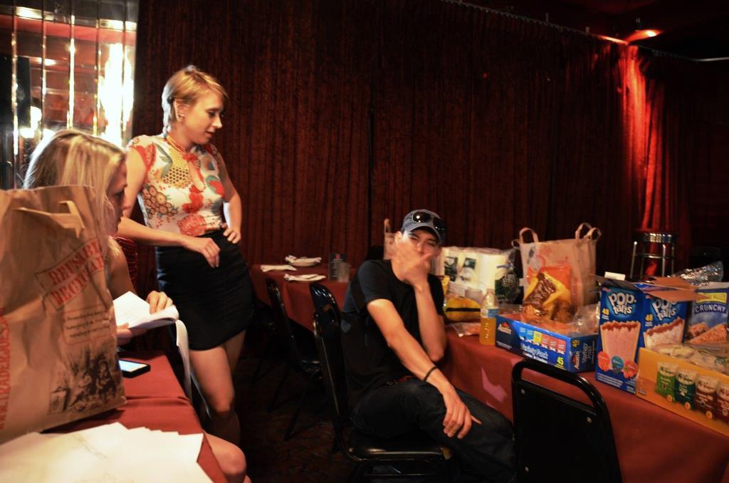
Paula Fradio At The Wardrobe Visit

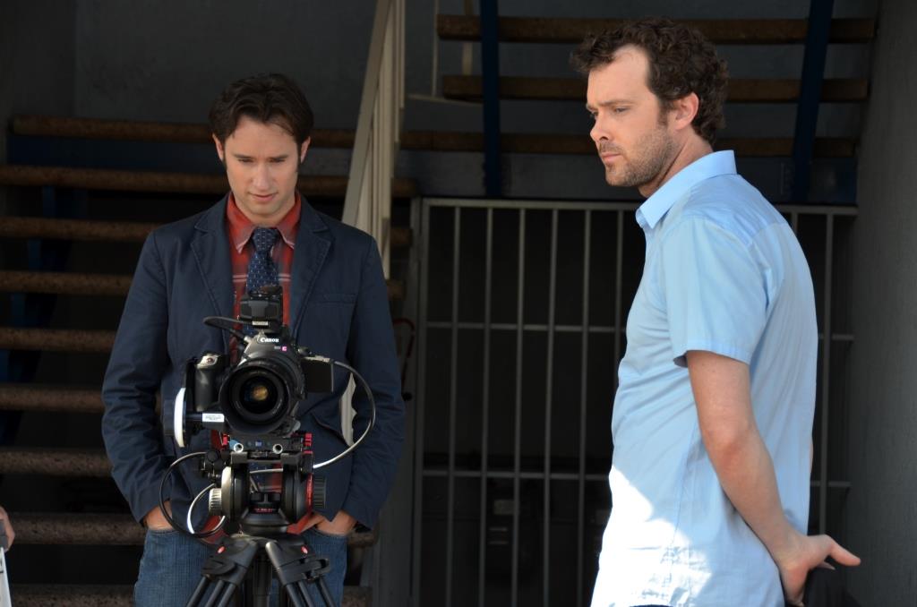
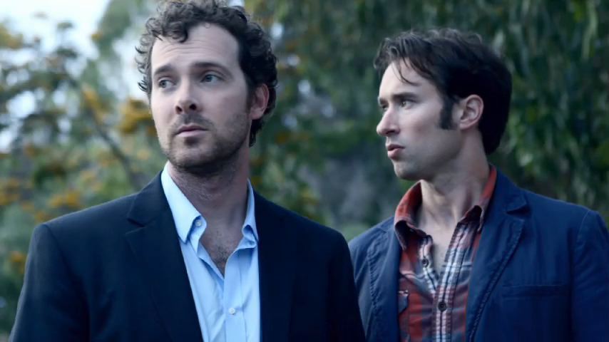
The Layer Thing For Matt's Character Even Started In The Pitch Video But It Was More Accident Than Deliberate - I Just Wanted Matt In Blue To Contrast Andy In Red - Photo By Julius Galacki